|
|
Post by ronmail65 on Jun 19, 2008 20:17:18 GMT -5
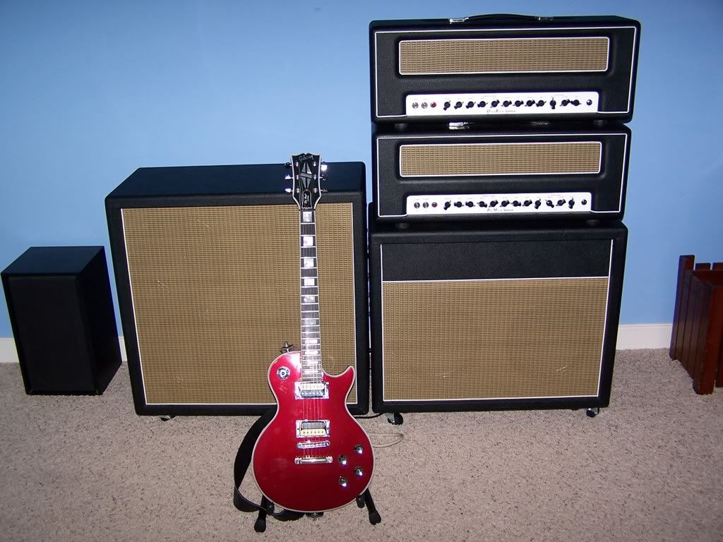
QR on top, PM on bottom, Avatar cabs. A '78 LP Custom.  |
|
|
|
Post by LooseCannon on Jun 19, 2008 21:19:52 GMT -5
Where are the logos man?
|
|
|
|
Post by Dirrty Craig on Jun 19, 2008 23:12:18 GMT -5
Yeah why take the logo off? I notice you didn't scrape "gibson" off your headstock.  |
|
|
|
Post by ronmail65 on Jun 20, 2008 9:13:52 GMT -5
Not trying to make a statement about logos or anything like that.... here's a short story of how the logos came to be removed... I first got the PM head which originally had the white chicken wire on the front. I immediately disliked the look of the chicken wire, but I settled for it because it was hard to get any PM at the time. A few months later I got an Avatar vintage cab (as shown), which sounded way better than my existing M*** 1960 cabs (which have all been sold at this point). I like the wheat grill cloth on the Avatar so I got some extra and decided to replace the chicken wire on the PM. The screws on the Splawn logo weren't long enough to go through the cloth and the luan board I put behind it. So I temporarily set the logo aside until I got longer screws. At about the same time, I noticed the Avatar logo was falling off (it's just hot glued on). I removed it with the intent of re-gluing. But I liked what I saw, so I left it alone. I have since acquired another cab and QR which I have modified similarly (as shown). Nothing against 'logos' or the companies they represent, it just happened to work out this way and I like the way it looks. I'm a huge advocate of both Splawn and Avatar. What do you think? ...No good? Should I put the original logos back? Should I plagiarize and mount other logos such as "ACME" or "CUISINART" or "TROJAN"  |
|
|
|
Post by LooseCannon on Jun 20, 2008 9:24:17 GMT -5
IMO they just look weird without the logos
|
|
|
|
Post by Ayton(e) on Jun 20, 2008 10:23:50 GMT -5
I actually think it all looks great that way. William Gibson would be proud (the heroine in his book 'Pattern Recognition' is allergic to brands and removes them from everything).
You also create a synergy between the cabs and heads. Now they all look like they're from one place.
The blankness is weird, but in a good way. It looks like you bought it all in The Sims.
|
|
|
|
Post by VomHalen on Jun 20, 2008 10:24:35 GMT -5
i'd throw the logos on the amps and leave them off the cabs if you want
|
|
|
|
Post by ronmail65 on Jun 20, 2008 11:56:03 GMT -5
The last few gigs when I've used the amps looking this way I get a lot of interest from people (other guitar players mostly). "Great amp tone!!...What is it?" "Are they custom made amps?" "Where did you find that gear?" etc... It's a conversation starter.
But, I have considered putting at least the Splawn logos back because I really am proud to be using these amps. As far as the cabs go... Avatar makes a great cab, but tonally it's really about the speakers (plus I don't own a hot glue gun). Truth is, I'm probably too lazy and disinterested to make the effort to put any of them back on...It's just an advertisement anyway.
On a related topic, I remember seeing Pat Travers a few times in the mid '80's (and many times since then). He used to have these cool chrome "Travers" logos on his cabs. Cool for him, but I wouldn't be bold or egotistical enough to do that with my name. Love the old PT material!!
|
|
|
|
Post by Ayton(e) on Jun 20, 2008 12:24:17 GMT -5
"Rawn" ;D
|
|
|
|
Post by drweller on Jun 20, 2008 20:22:45 GMT -5
Did you go for the open or closed back vintage/oversized 212? NOtice any mush/woofy bass/enhanced low-mids? QR on top, PM on bottom, Avatar cabs. A '78 LP Custom.  |
|
|
|
Post by 4x12 on Jul 1, 2008 2:59:41 GMT -5
QR on top, PM on bottom, Avatar cabs. A '78 LP Custom.  Hi guys, This is my first post on the Splawn forum & I just had to comment on this pic. Dude, this setup looks incredible. I seriously love the classy look you got going. 2 thumps up dude!! |
|
|
|
Post by convert on Jul 3, 2008 1:24:00 GMT -5
I would put those logos back on at the next available breath. REPRESENT for Splawn! I don't know... I don't mind sharing the info with other people.... so they don't have to guess what kind of amp you're jamming... they just FREAKIN know!
|
|
|
|
Post by johnnyjellybean on Jul 12, 2008 9:55:48 GMT -5
I recently finished changed the front panel on my QR to a plexi style and didn't put the logo on right away. Well after about a week I took the time to compare with and without using 2 sided tape and I decided it looked WAY better with so I installed it.
|
|
|
|
Post by glassjaw7 on Sept 27, 2008 17:09:32 GMT -5
I think it looks cool with no logos. Very clean.
|
|
|
|
Post by TuskerKevin on Sept 27, 2008 17:44:20 GMT -5
I vote to put the Splawn logos back on....push Splawn whereever you can...IMHO
|
|